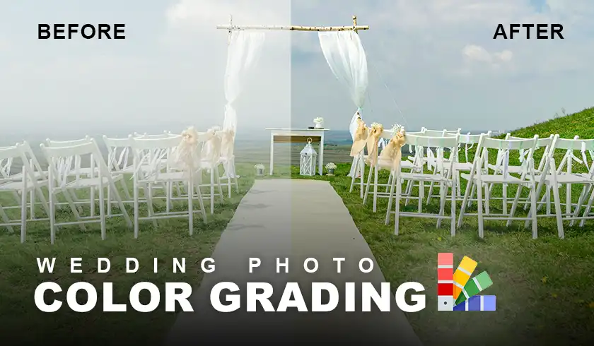
Wedding photo color grading is a crucial step in creating stunning, memorable images that capture the essence of a couple’s special day. As a wedding photographer, I’ve seen firsthand how the right color grading can transform good photos into extraordinary ones. It’s not just about making pictures look pretty – it’s about evoking emotions and telling a story through color.
In this article, I’ll explain what it means, why it’s important, and how it can elevate your wedding photography to new heights. Whether you’re a bride-to-be, an aspiring photographer, or just curious about the magic behind those dreamy wedding photos you see on Instagram, you’re in for a treat. Let’s get started!
What Does Color Grading Mean?
Color grading is like adding the perfect seasoning to a delicious meal. It’s the secret sauce that takes wedding photos from “meh” to “wow!”
Color grading is the process of adjusting the colors, tones, and overall look and feel of wedding photos. It’s an essential part of my post-processing workflow as a wedding photographer. The goal? To create a cohesive and polished aesthetic that’ll make my clients swoon.
When I’m color grading wedding photos, I’m aiming for three main things:
- Consistency: I want all the photos in a wedding gallery to have a consistent color palette and mood. This helps tell a cohesive visual story of the day.
- Correction: Sometimes, the original photos might have color casts or white balance issues. Color grading helps me fix these technical problems and make the photos look their best.
- Creative Expression: This is where the fun really begins! I use color grading to apply a specific creative style that gives the photos the desired look and feel. It could be a warm, romantic vibe or a cool, modern aesthetic – whatever best suits the couple and their wedding day.
Popular Wedding Color Grading Styles
Now that we know what color grading is all about, let’s talk about some popular styles you might come across in wedding photography.
When it comes to wedding color grading, there’s no one-size-fits-all approach. Different styles can create different moods and vibes. Here are some of the most popular ones I use:
Classic/True to Life
This style is all about keeping things natural and vibrant. I love using this approach when I want to enhance the colors that were already there on the wedding day. It’s perfect for couples who want their photos to look timeless and true to life.
Airy/Light and Bright
If you’ve ever swooned over those dreamy, ethereal wedding photos on Pinterest, chances are they were edited in this style. It’s perfect for outdoor weddings with light and pastel colors. I often use this style for beach or garden weddings – it just makes everything look so fresh and romantic!
Moody/Dark and Romantic
For those couples who want something a bit more dramatic, this style is a winner. It’s great for creating an intimate, romantic atmosphere in the photos. I find it works particularly well for winter weddings or evening receptions.
Vintage/Muted and Desaturated
Want to give your wedding photos a bit of a throwback feel? This style creates a nostalgic, timeless look by muting the colors slightly and adding a touch of grain. It’s like looking at your grandparents’ wedding album, but with modern-day clarity!
Key Techniques in Wedding Photo Color Grading
Alright, let’s get a bit technical! Here are some of the main techniques I use when color grading wedding photos:
White Balance Adjustment
This is often my first step in color grading. I adjust the white balance to correct any color casts in the original photos and ensure neutral whites. It helps create a more natural and balanced look. Trust me, you don’t want the bride’s white dress looking yellow or blue!
Color Channel Adjustments
This is where I get to play with the red, green, and blue color channels to shift the overall color tone of the image. Want to create a warmer look for those sunset photos? I’ll bump up the reds and yellows. Going for a cooler, more ethereal feel? I’ll enhance the blues and greens.
Contrast and Exposure Adjustments
Increasing or decreasing contrast and exposure can add drama, depth, and emphasis to the key elements in the photo. It’s amazing how a little tweak can make the bride’s dress pop or the groom’s eyes sparkle!
Selective Color Grading
Sometimes, I want to draw attention to specific areas of the image. That’s where selective color grading comes in handy. I might apply different color grades to the bride’s dress, the groom’s suit, or the background to make certain elements stand out.
Use of Presets and LUTs
Presets and LUTs (Look Up Tables) are like recipe cards for color grading. They’re pre-made color grading settings that I can quickly apply to achieve a desired aesthetic. Of course, I always fine-tune them to suit each specific photo.
Wrapping Up
Color grading is a powerful thing that can truly elevate wedding photography. It’s not just about making photos look pretty – it’s about capturing the emotions, atmosphere, and unique story of each couple’s special day. Remember, your wedding photos are more than just images – they’re memories you’ll treasure for a lifetime. Choosing a photographer who understands the art of color grading can help ensure those memories are as vivid and beautiful as the day itself.
If you have any questions about wedding photo color grading that weren’t covered here, feel free to ask in the comments below. Thanks for reading, and here’s to beautiful, perfectly color-graded wedding photos in your future!