Achieving ideal saturation without crossing into oversaturated neon territory challenges me as a photo and video editor. I often fail to realize skin tones turning sunburnt orange or skies glowing radioactively blue until after exporting. My over-eagerness for bold, vibrant colors backfires, resulting in unnatural, distracting edits. I need techniques to recognize exaggeration during adjustments plus fixes to rescue already-botched projects. Understanding color spaces, utilizing scopes, strategically guiding audience eyes, and subtly undersaturating tricky elements will help me walk the line between punchy and sickly. I aim to develop restraint sensibility and recovery skills for professional edits every time in my editing career. My quest for gorgeous color without garishness starts here!
Techniques to Avoid Oversaturation
Preventing oversaturated colors starts before editing even begins. By understanding color spaces, utilizing measurement tools, and judiciously applying saturation adjustments, editors can stay within ideal parameters.
Understand Color Spaces And Gamuts
The first step is understanding color spaces like sRGB and AdobeRGB, plus device gamuts. Knowing a camera or display’s capable saturation levels compared to editing color spaces helps identify unrealistic adjustments. As an example, boosting reds in sRGB beyond a display’s limit blows channels.
Gamut limits also highlight edits pushing saturation too far. As colors approach extremes, hue and luminance distortions happen even before clipping. Viewing edits on properly calibrated monitors helps reveal these issues for correction beforehand.
Overreaching beyond that range creates the dreaded “clipping,” where colors lose detail and turn neon monsters. So, respect your gamut boundaries – they’re like the lines on a coloring book, there to guide you, not confine you.
Use Waveform Monitors And Vectorscopes
Don’t trust your eyes alone! Waveform monitors and vectorscopes act like X-ray glasses for your edits. Measurement tools like waveform monitors and vectorscopes scientifically indicate saturation levels. Skin tones landing outside ideal ranges shout warnings. Vectorscopes showing highly saturated colors way out from the center reveal channels blowing past acceptable limits.
Getting used to reading these scopes provides numerical and visual feedback for saturation. Rather than just eyeballing, editors quantifiably finalize adjustments within broadcasting and printing tolerances for professional standards.
Limit Saturation Adjustments
With understanding and measurement established, exercise restraint when actually adjusting saturation. Rarely do edits need more than slight tweaks within a color space’s specifications before skin tones distort or channels clip. Make micro adjustments to fine-tune saturation rather than macro boosts.
Separately targeting individual color channels protects the balance between hues. Compared to an overall saturation increase, this avoids some colors getting disproportionately vivid. Surgical tools like hue/saturation curves permit controlled alterations. Furthermore, confining impacts to regions using masks helps restrict oversaturation to specific elements without tainting entire frames.
What to Do If a Picture is Oversaturated?
No editor perfectly adjusts saturation at all times across endless frames. Even seasoned professionals get tunnel vision or apply overly aggressive tweaks resulting in oversaturated slip-ups. Thankfully, post-processing remedies offer salvation.
First, Find Oversaturation in Your Pictures in Photoshop
Editors must first visually identify overly vivid colors. Reference media like skin tones or grass reveal unwanted deviations. Measuring tools scientifically confirm issues numerically and vectorscopically.
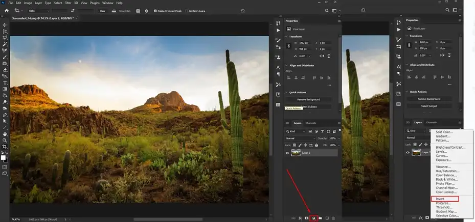
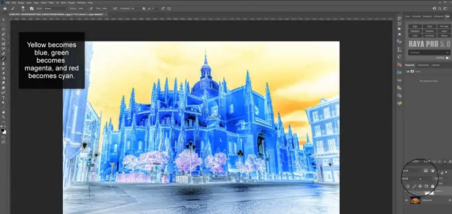
- Once oversaturation is quantified, use Photoshop adjustments to reduce excesses. Click on the Create new fill or adjustment layer icon at the bottom of the Layers panel and choose Invert from the menu. This will add a new Invert adjustment layer.
- Adjustment layers allow you to apply color and tonal adjustments to your image without permanently changing the pixels. The invert adjustment will help reveal oversaturated areas.
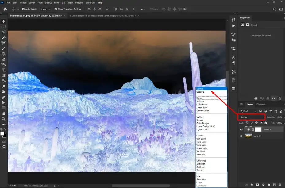
- With the Invert adjustment layer selected in the Layers panel, change the blending mode drop-down menu from Normal to Color.
- Blending modes determine how the adjustment layer pixels interact with the layers below it. The Color mode reveals oversaturated colors.
- Lower the Opacity of this layer to 50% so the inversion is partially applied. This will make oversaturated colors stand out but still allow you to see the original image underneath.
- Combining the Color blending mode and 50% opacity on this layer exaggerates the saturation in a way that makes oversaturated colors clearly visible.
And Then Kick Out the Headache of OVERSATURATION from the Party
For already oversaturated media, deftly eliminate saturation surpluses salvaging edits. Start by expanding gamuts with wider color space encodings to regain lost data. Then replace distortions utilizing clean plate footage capturing missing luminance and color channel resources from scratch. Here are the steps to follow –
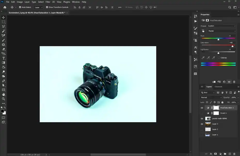
- Add a Hue/Saturation Adjustment Layer below the Invert Layer.
- Select the most oversaturated colors in the image using the Color Range Selector tool. Click on the highly saturated colors to select them.
- On the Hue/Saturation layer, lower the Saturation levels of the selected oversaturated colors to reduce the saturation and make those areas grayscale.
- Repeat steps 4-5 for any other oversaturated colors in the image. Continue sampling colors with the Color Range Selector and desaturating them with the Hue/Saturation layer to target and neutralize oversaturation throughout the image.
- Use the two Adjustment Layers together in this way to effectively control and correct oversaturation in Photoshop.

Alternatively, spectra tools mathematically model channel interdependencies recovering distorted relationships. Finally, denoising clears out magenta/green and blue/yellow drift revealing underneath detail. Just don’t overdo noise removal losing essential texture. A bit of cleverness and patience puts perfection within reach!
Issues Associating Oversaturated Images
Oversaturated images, like guests who overstay their welcome at a party, can disrupt the visual harmony and leave viewers feeling overwhelmed and fatigued. Let’s dive into the issues associated with oversaturated images and understand why toning down the intensity can be key to creating impactful visuals.
Loss of detail – When an image is oversaturated, areas that should have detail get washed out into blocks of color. Subtle gradients, textures, and edges can get lost. This makes editing more difficult and limits what you can do with the image.
Unnatural colors – Oversaturation typically leads to colors that are neon-like and not realistic. Skin tones in particular can look unnatural and artificial when oversaturated. This may be visually unappealing.
Difficult to print – Prints made from oversaturated images often don’t match what you see on screen. The colors may end up duller and darker when printed. The loss of detail may become even more apparent.
Eye fatigue – Viewing oversaturated images for extended periods can lead to eye strain and fatigue faster than properly saturated images. The unnaturally bright colors are taxing on the eyes.
Difficult to calibrate – It’s challenging to color calibrate and create an accurate profile for a display that shows oversaturated images. You end up adjusting to the extreme colors rather than seeing details accurately.
Visually overwhelming – In some oversaturated images, there is nowhere for the eye to rest. High saturation combined with a busy scene can be visually exhausting.
How To Achieve Ideal Saturation?
Creating properly saturated visuals requires considering creative and technical goals plus audience expectations. Building edits around these aspects leads to ideal vividness for professional quality.
Complement Content And Creative Goals
Saturation levels need relevance to the subject material and creative aims. A neon cityscape or abstract art warrants higher saturation than, say, a nature documentary. Appropriate vividness complements visual stories rather than distracting.
Mood also influences suitable saturation extremes. Somber themes need restraint while light-hearted ones afford punchier hues. Across various projects, relatable colorfulness visually communicates themes and meets viewer assumptions.
Guide Audience Focus
Strategic saturation guides the audience’s eyes across frames. Vibrant elements prominently stand out from subdued backgrounds. Subject separation from contexts focuses attention on storytelling, whether saturating people in portraits or products against muted environments.
Even within subjects, color variety creates visual interest and direction. Augmenting reds and oranges in a sunset while cooling opposing skies, for example, pulls the viewer and establishes depth. Using saturation to make strategic elements pop keeps audiences engaged.
Allow Critical Colors To Stand Out
Certain colors carry meaning or emotional weight and warrant isolation. For example, red is energized and urgent. Blue connotes professionalism and peacefulness. Emphasizing just important hues through targeted saturation emphasizes meaning relying on color psychology.
Symbols and brands similarly require accurate colors to maintain identities and meanings across applications. Preserving precise saturation and constraining adjustments helps content respect essential color reproduction needs. Limiting edits prevents misrepresentation or mixed messaging from destroying creative impacts.
FAQs Time
What causes oversaturated colors in pictures/videos?
Overaggressive saturation adjustments during editing usually cause oversaturated media. Editors attempting to make scenes seem more vibrant inadvertently push saturation excessively high causing distortion and unnaturalness. Lack of monitoring scopes or distorted viewing environments also contribute to hiding issues until final delivery.
What does an oversaturated video look like?
Oversaturated video exhibits unnaturally intense, glowing colors, especially in reds, greens, and blues. Skin appears sunburned and lacks texture detail. Blue skies seem radioactive. Hazy magenta/green casts make images appear hallucinogenic rather than realistic. The visual weight of elements feels skewed.
How do I dull down colors?
Dulling oversaturated colors requires reining in their vividness. Hue/saturation tools reduce intensities globally or through masks and selections. Complementary color filters cancel out intensity. Desaturate adjustment layers subdue separate color channels’ contributions. Reducing brightness and contrasts also diminishes perceived saturation without actually altering colorfulness.
In summary,
avoid oversaturated visuals by understanding color fundamentals, monitoring adjustments with scopes, and strategically guiding focus. Seek professional help if you need to reduce intense reds blinding audiences rather than attracting eyeballs. For rescuing distorted colors and clips, we offer gamut expansions, spectral recovery services, and custom saturation restorations. Our color correction expertise delivers ideal vividness to your projects. For getting rid of oversaturation issues, try us today! We’ll have your edits shining brightly and naturally in no time.