Making a logo white in Photoshop can be useful for many reasons. You may need a white version of your logo for printing on dark backgrounds or to create a minimalist look. Photoshop provides a couple of easy ways to turn a logo white – you can completely replace all the colors or selectively desaturate parts of the image. In this comprehensive guide, we’ll walk through the steps to make a logo fully white or partially white in Photoshop using hue/saturation adjustment layers and blending modes.
Steps to Make a Logo White in Photoshop
Here are the steps to completely remove color from a logo and turn it solid white in Photoshop:
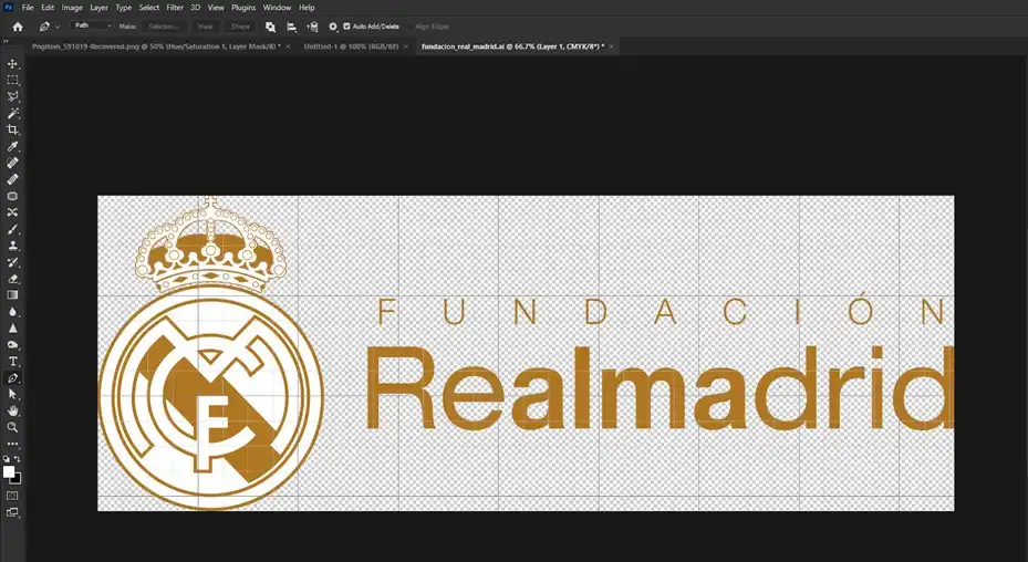
- Open your logo file in Photoshop. The logo can be in JPEG, PNG, PSD or any other standard image format supported by Photoshop.
- Duplicate the logo layer in the Layers panel to create a backup copy. You can do it by right-clicking on your existing layer or can do it by pressing the Ctrl + J key shortcut.
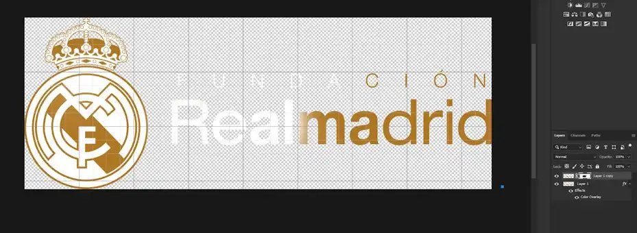
- On the duplicated logo layer, go to Layer > Layer Style > Color Overlay. Or you can simply double-click on the layer, and then navigate to Color Overlay from there.
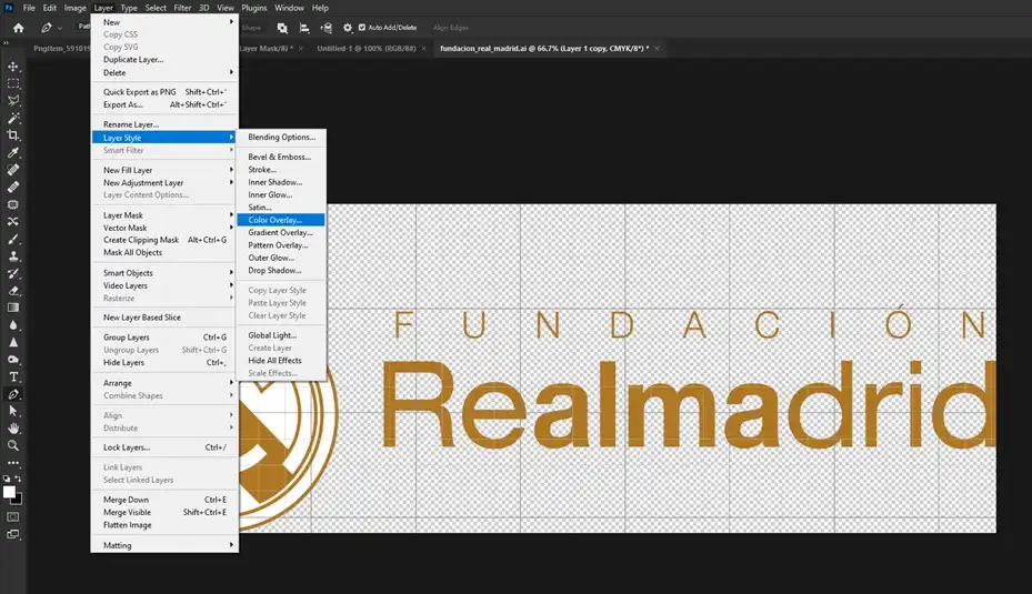
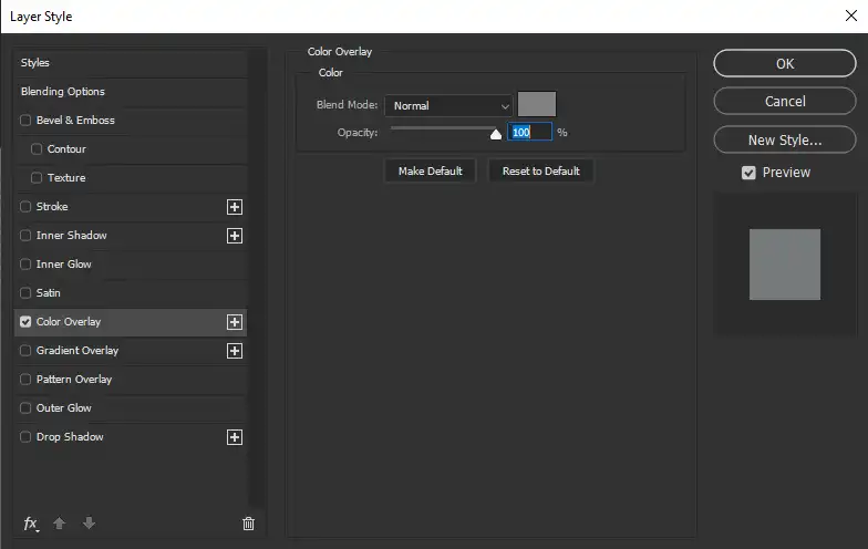
- In the Color Overlay settings, choose white as the overlay color and make sure the opacity is set to 100%.
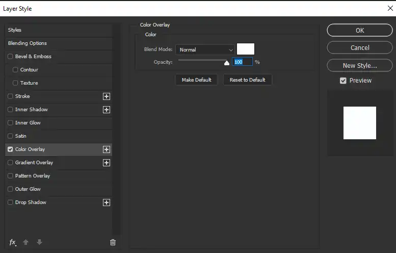
- Click OK to apply the white color overlay.
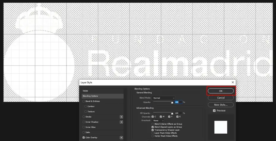

Your logo should now be completely white! This provides a quick way to convert the logo to white using a layer style rather than adjusting hue and saturation. The backup layer preserves the original logo colors as well.
Steps to Make a Logo White in Photoshop Using Hue/Saturation Option
The Hue/Saturation dialog box provides another way to adjust saturation in Photoshop. Here is how to use it to make a logo white:
Step 1. As before, open your logo file in Photoshop.
Step 2. Access the Hue/Saturation controls by going to Image > Adjustments > Hue/Saturation. Or, you can navigate to the option by using the shortcut panel which is located at the middle of the right pane of your monitor. You can also get into the hue/saturation settings by pressing Ctrl + U shortcut.
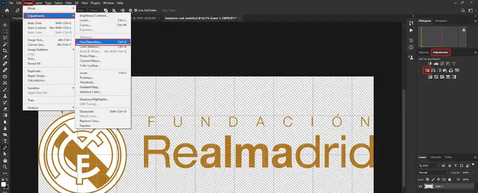
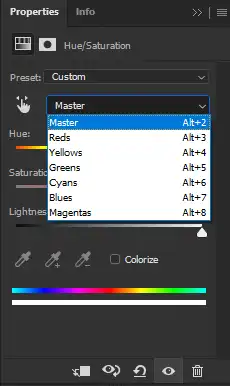
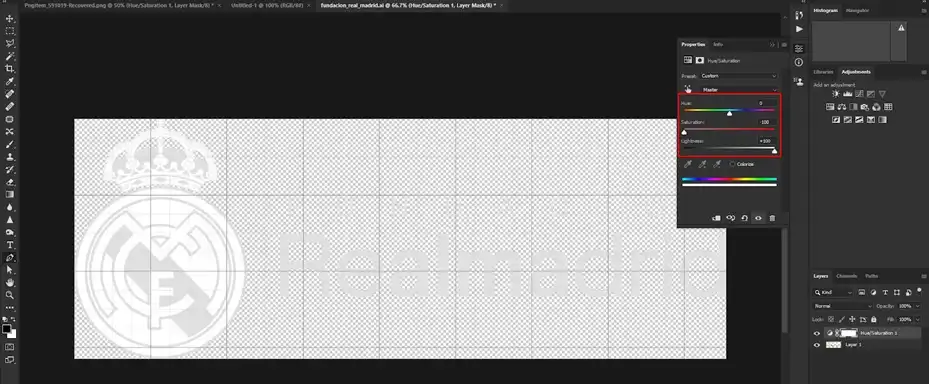
Step 3. In the Channel drop-down, choose Master to adjust all colors together or press Alt + 2.
Step 4. Drag the Saturation slider all the way to the left to -100 to remove all color.
This achieves the same result as using an adjustment layer, just with a different method. The Hue/Saturation dialog provides a quick way to desaturate the entire image at once.
Steps to Make a Logo Partially White in Photoshop
Rather than making the entire logo white, you can selectively desaturate parts of it with blending modes:
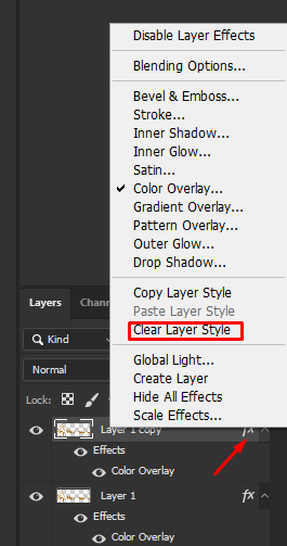
Step 1. Right-click on the fx of the duplicate layer and click on Clear Layer Style.
Step 2. After that, add a layer mask to that layer.
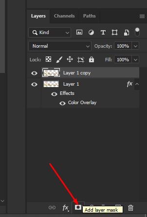
Step 3. Choose the Brush tool, and start brushing the parts that you want in White color.
Making a logo white in Photoshop is easy whether you want to fully desaturate it or selectively turn parts of it white. Hue/saturation adjustment layers give you the flexibility to tweak the settings. Blending modes like luminosity provide localized control. With these techniques, you can create stylish white logos tailored to your design needs.
Benefits of Having a White Logo Version
There are many benefits to having a white version of your company or brand logo available:
- Print versatility – A white logo works great for printing on dark-colored backgrounds, products, and packaging. The high contrast helps the logo pop.
- Minimalist aesthetic – An all-white logo has a clean, minimalist look that can appeal to modern brands and styles. It focuses attention on the icons and shapes.
- Adaptability – A white logo version expands options for using your logo in designs, videos, and presentations – anywhere a high contrast or inverted logo is needed.
- Brand Recognition – Keeping your logo’s iconography while changing to white maintains brand identity and recognition even on inverted backgrounds.
- Creative possibilities – A white logo opens the door to creativity with effects like knockouts, transparencies, overlays, and filters for unique stylized looks.
Having alternate versions of your logo for different contexts helps maintain the integrity and versatility of your brand identity. Taking a few minutes to create a white logo in Photoshop gives you flexibility across many applications.
Tips for Working with White Logos
Here are some tips for creating and working with white logos in your designs:
- Maintain legibility – Make sure your icon, text, and shapes are clearly defined and legible when inverted to white. Thicker weights and larger sizes can help.
- Watch the kerning – With less color contrast, improper kerning in letterforms becomes more apparent. Check and adjust as needed.
- Boldly define edges – Avoid partial drop-outs and maintain definition with clearly defined edges around shapes.
- Simplify details – Intricate details in an icon or letterform may get visually lost, so simplify where you can.
- Add shadows and outlines – For definition and contrast against light backgrounds, add subtle shadows, outlines, or borders.
- Choose background wisely – Dark backgrounds provide needed contrast. Busy backgrounds compete. Find the right balance for clear prominence.
- Resize proportionately – When scaling for different uses, maintain proportionality so the logo doesn’t become distorted.
A few quick adjustments like simplifying intricate details in your white logo can go a long way to maintaining attractiveness, clarity, and professionalism.
What to Avoid When Creating White Logos
There are a few mistakes to avoid when converting your logo to a white version:
Don’t lose contrast and definition – If edges and details become faint or disappear, the logo will lose definition.
Don’t add unnecessary effects – Things like gradients, shadows, and textures can detract from a clean white logo.
Don’t skew or warp – Stretching or skewing the logo can make it appear unprofessional and cheap.
Don’t invert small logos – Heavy pixelation and artifacts will occur if the starting logo is very small.
Don’t use on busy backgrounds – If the background is too busy, the logo can be hard to distinguish.
Don’t use low contrast colors – Light greys or pastels won’t give your white logo enough contrast. Go for black or darker hues.
Taking the time to create a quality white logo version that avoids these pitfalls will pay off with a logo you can use confidently across many applications.